Meest gelezen blogs 2021 (top10)

Ook het 2e coronajaar liet zijn stempel achter. De blog Oversterfte de belangrijkste indicator kwaliteit zorgstelsel bij pandemie van 31 december is (nu al) het meest gelezen!

1 – Oversterfte de belangrijkste indicator kwaliteit zorgstelsel bij pandemie

2 – #Zorginfarct!

3 – Vaccinaties: Nederland voldoet als enig EU-land niet aan registratieverzoek ECDC

4 – Ernst Kuipers versus Raisa Blommestijn (@Jinek_RTL)

5 – De triomf van het principevrije leiderschap (analyse TK2021)

6 – Rectificatie in ESB-publicatie ‘Zorgverzekeringswet helpt om zorguitgaven in toom te houden’

7 – Discussiestuk ‘Zorg voor de Toekomst’ (internetconsultatie minVWS)

8 – Systematische onderrapportage covidsterfte NL:’Dutch Data?’

9 – Israël gaat er met gestrekt been in (corona)

10 – De #zorgcrisis in 4 beelden

Meeste media views

Meest gelezen blogs 2020, het 1e coronajaar (top10)

Systematische onderrapportage covidsterfte NL:’Dutch Data?’

Ruim een jaar na het uitbreken van de pandemie doet Nederland nog steeds aan internationale onderreportage van de coronasterfte. Dit is toch opmerkelijk. Wat is hier aan de hand?! Dutch Data?

Het CBS meldde deze week dat er in januari 4.400 mensen zijn overleden aan corona. Eerder meldde CBS dat de coronasterfte in 2020 in totaal 20.000 personen betrof. Als we de cijfers tot en met januari 2021 nemen en dit totaal van 24.400 delen op 17,25 miljoen dan is de uitkomst 1.414 doden per miljoen inwoners (per 31/1/2021).

Rekening houdend met een vertraging in de aanlevering van cijfers naar de internationale instanties met 2 weken kijken we naar de cijfers op de bekende, veel geraadpleegde website ourworldindata.org. Per 15 februari 2021 rapporteert Nederland 873 doden per miljoen inwoners. Dit is een onderrapportage van 62%.

Nederland komt dus uit boven Spanje en scoort een top5-positie van EU14 landen met de hoogste coronasterfte. NB: Ten tijde van het Corona Dashboard EW16/W28 (zie bij bronnen) was de onderrapportage van Nederland 72%.

Bronnen

https://www.cbs.nl/nl-nl/nieuws/2021/18/bijna-4-4-duizend-mensen-overleden-aan-covid-19-in-januari

https://nos.nl/artikel/2375697-cbs-afgelopen-jaar-ruim-20-000-coronadoden

https://ourworldindata.org/covid-deaths

https://coronadashboard.rijksoverheid.nl/landelijk/sterfte

Eigen bronnen

Covid19NL: de 4e golf (niet de 3e)

Vaccinaties: Nederland voldoet als enig EU-land niet aan registratieverzoek ECDC
Corona: 2e golf in Europa, enkele statistieken (II)

https://gijsvanloef.nl/2020/09/26/kaart-europa-toont-nederlands-falen-in-de-2e-coronagolf/

position paper Lessons Learned VWS / Dashboard
Corona Dashboard EW16/W28
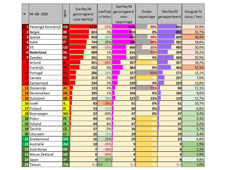
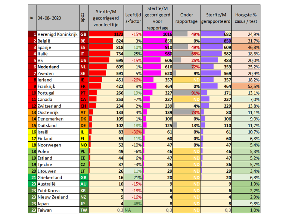
Laatste versie van Corona Dashboard EW16/W28 met onderrapportage per land. EW16=EU14+Ierland&Griekenland. W28 is het uitgebreide overzicht met 28 landen, hier staan er 23. Klik op de link hierboven voor meer informatie.

Vaccinaties: Nederland voldoet als enig EU-land niet aan registratieverzoek ECDC

474 views

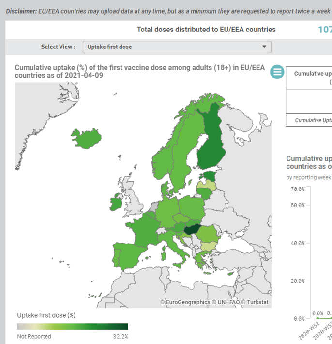
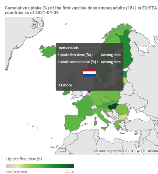
update 10 april - NEDERLAND HEEFT ALS ENIGE EU-LAND ZIJN REGISTRATIE NIET OP ORDE. 
European Centre for Disease Prevention and Control: "EU/EEA countries may upload data at any time, but as a minimum they are requested to report twice a week." 
Zie hieronder de oude post, laatst geactualiseerd rie dagen geleden.
----------------------------------------------------------------------------------------------------

Van meet af aan zit Nederland van de EU14 wederkerend in de bezemwagen qua aantal vaccinaties per inwoner.

Selectie van alle moderne west-europese landen (EU14), de standaard verzameling in mijn publicaties en blogs over de medische gezondheidszorg in ons land.
Het VK met een vaccinatiegraad boven de 50% is niet getoond in de bovenste grafiek. Data van Nederland lopen achter.


Bronnen: Ourworldindata.org, economist.com
Eerdere publicaties:
Discussiestuk Zorg voor de Toekomst
Zo raakte Nederland achterop bij het vaccineren
Medische zorg achteruit op alle zorgranglijsten
Kosten en kwaliteit EU14 obv OECD Health at a Glance 2019
Het Platform Betrouwbare Zorgcijfers doet een oproep aan de landelijke media Goede gezondheidszorg begint bij betrouwbare cijfers

Corona: 2e golf in Europa, enkele statistieken (II)

Deze post is afgesloten.

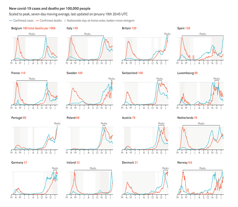
20/1/’21 – update Tabel, Economist (NB: Gisteren publiceerde Economist enige tijd de verkeerde grafiek, waarbij de kleuren rood en blauw verwisseld waren, zie afb. links:goed en rechts: fout)

De ontwikkeling van het aantal coronadoden in ‘modern Europa’ (Griekenland is toegevoegd obv. de opmerkelijke lage uitkomst van de 1e golf) blijft interessant. De sterfte in de 2e golf is inmiddels hoger dan in de 1e golf, ondanks de lessons learned zoals de progressie in de vroegbehandeling mbv. medicijnen.

(1e golf in totaal ca. 180.000, 2e golf inmiddels ca. 250.000)

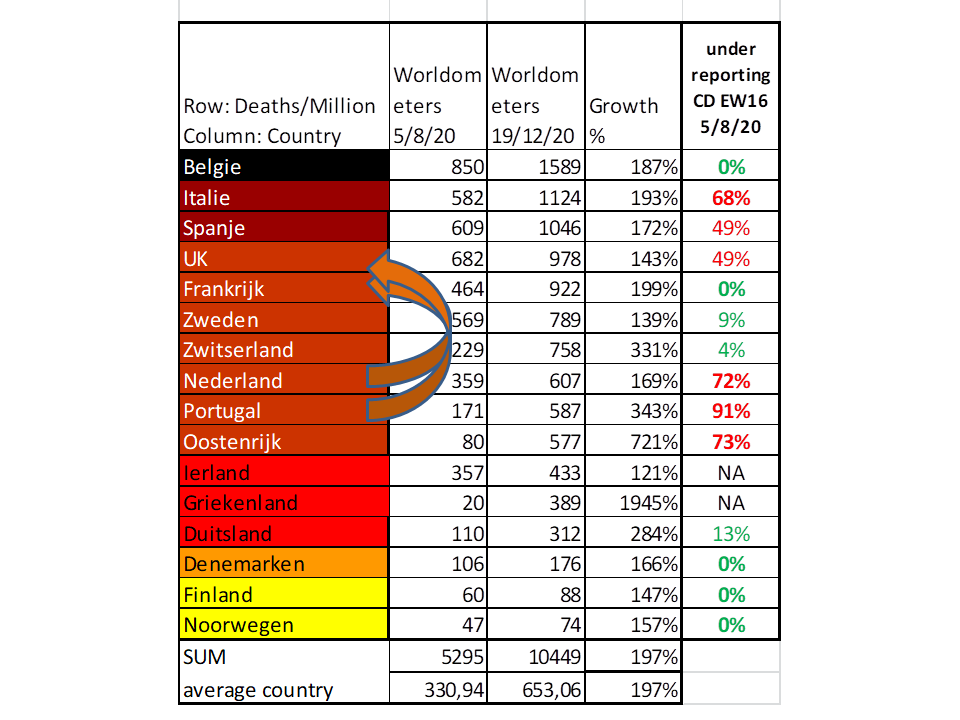
Op basis van dezelfde indeling als het CORONA DASHBOARD EW16/W28 maar zonder de correcties voor bevolkingsopbouw en onderrapportage is de lijst nu als volgt:
(bron: Corona Dashboard EW16/W28)

•   Zwart: > 1500 doden per miljoen inwoners – België
•   Diep donkerrood: 1000-1500 doden per miljoen inwoners – Italië, UK, Spanje, Frankrijk, Zweden, Zwitserland
•   Rood: 500-1000 doden per miljoen inwoners – Portugal, Oostenrijk, Nederland, Duitsland, Griekenland, Ierland
•   Sierra: 200-500 doden per miljoen inwoners – Denemarken
•   Lichtbruin: 100-200 doden per miljoen inwoners – Finland
•   Geel : 50-100 doden per miljoen inwoners – Noorwegen


Toelichting tabel:
5/8/20 – peildatum einde 1e golf: aantal geregistreerde coronadoden/miljoen, bron: worldometers
20/1/21 – peildatum midden 2e golf: aantal geregistreerde coronadoden/miljoen, bron: worldometers.
underreporting CD EW16: onderreportage doden (excess mortality: hoe hoger het %, hoe groter de onderreportage)


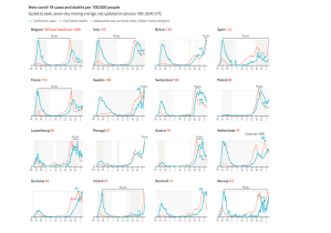
Economist, 20/1/2020
NB Griekenland en Finland ontbreken in deze visualisatie. Tip: vergelijk met de landentabel.

Oude post met bronnenlijst: Corona 2e golf Enkele statistieken

Corona: 2e golf in Europa, enkele statistieken

post is beëindigd
Wie meer wil weten over het coronavirus kan vele bronnen raadplegen. Ik kan de website van Dr. John Jacobs van aanbevelen: hartblik.nl Onnavolgbaar beleid dat verkeerd uitpakt

laatste update 19/12/20 – Portugal doet het nog slechter dan Nederland obv. de ‘onderrapportage-constante’. Dit zou betekenen dat van alle West-Europese landen (plus Griekenland, dat een opmerkelijk laag aantal coronadoden telde in de 1e golf) Portugal en Nederland nu een 5e en 6e plaats innemen op deze ranglijst van coronadoden/miljoen inwoners.

Op basis van dezelfde indeling als het CORONA DASHBOARD EW16/W28 maar zonder de correcties voor bevolkingsopbouw en onderrapportage is de lijst nu als volgt:

(bron: CD EW16/W28 hartblik corona dashboard en corona dashboard EW16/W28)

•   Zwart: > 1500 doden per miljoen inwoners – België
•   Diep donkerrood: 1000-1500 doden per miljoen inwoners – Italië, Spanje
•   Sierra: 500-1000 doden per miljoen inwoners – Verenigd Koninkrijk (UK), Frankrijk, Zweden, Zwitserland, Nederland, Portugal, Oostenrijk
•   Rood: 200-500 doden per miljoen inwoners – Ierland, Griekenland, Duitsland
•   Lichtbruin: 100-200 doden per miljoen inwoners – Denemarken
•   Geel : 50-100 doden per miljoen inwoners – Finland, Noorwegen


Toelichting tabel:

5/8/20 – peildatum einde 1e golf: aantal geregistreerde coronadoden/miljoen, bron: worldometers
19/12/20 – peildatum midden 2e golf: aantal geregistreerde coronadoden/miljoen, bron: worldometers
underreporting CD EW16: onderreportage doden (excess mortality: hoe hoger het %, hoe groter de onderreportage)


Toelichting grafiek 1:

Hoge excess mortality 2e golf EW16-landen (alleen landen met data t/m 8/11/20), bron: ourwoldindata


Toelichting grafiek 2:

Lage excess mortality 2e golf EW16-landen (alleen landen met data t/m 8/11/20), bron: ourwoldindata
NB: Zweden, 1e golf en nu opnieuw een ‘uitbraak’ in de verkeerde richting (ca. 15%).

Wat opvalt: Landen met onderreportage (Tabel> rechterkolom) hebben tot nu toe een qua dodental ernstiger verloop van de 2e golf, dan landen zonder onderreportage (de Scandinavische landen en Duitsland). De werkelijke verschillen tussen beide groepen landen (grafieken 1 en 2, let op de verschillende Y-assen) zouden wel eens nog groter kunnen zijn.

————————————————————————————————————————————————————————————-

Internationale bronnen:
worldometers
ourworldindata
ECDC weekly overview per country
NYTimes
Economist

Rectificatie CPB n.a.v. “Cherry picking CPB bij ‘Zorgkeuzes in Kaart'”

315 views

update 1 maart 2021 – Rectificatie CPB middels erratum
CPB Zorgkeuzes in kaart 2020
Errata+Zorgkeuzes+in+Kaart+2020

25/11/2020 – Een stille bekentenis?

Het CPB heeft met het rapport ‘Zorgkeuzes in Kaart, Analyse van beleidsopties van politieke partijen voor de zorg’ – wellicht onbedoeld – een eenzijdig beleidsadvies voor de politiek uitgebracht. Het gaat om het hoofdstuk Stelselwijzigingen.

Tijdlijn
Het CPB is op 27 juli via de contactpersoon om een reactie gevraagd. Vraag: “Hoe moet ik in de tabel ‘Vermijdbare sterfte per 100.000 inwoners 2015’ en ‘% gemelde onvervulde zorgbehoefte 2016’ herleiden naar OECD Health at a Glance 2019?”
Op 2 sept. kreeg ik het volgende antwoord: “We zijn eruit: het blijken de getallen uit Health at a Glance 2018 te zijn. Ten tijde van het schrijven van de tekst was Health at a Glance 2019 nog niet gepubliceerd. Het betreft dus een fout in de verwijzing. De tabel is illustratief gebruikt en vormt geen input voor verdere berekeningen. We gaan na hoe we de typefout kunnen corrigeren. Hartelijk dank voor de oplettendheid.”

Kritiek op hoofdlijnen

Het hoofdstuk Stelselwijzigingen gaat in een notedop in op het type stelselwijzigingen (vijf typen, waaronder vier met meer publieke (overheids)regie – voer voor fijnproevers – en het verbieden van de winstuitkering door zorgverzekeraars ) en de technisch-financiele gevolgen daarvan inclusief de transitieperiode.

Ik heb twee fundamentele punten van kritiek. Opmerkelijk is dat aan de kostenkant schattingen zijn gemaakt, maar dat die aan de opbrengstenkant ontbreken. (Zie pag. 445: ‘geen ex-ante besparingen worden toegekend’). De coronacrisis heeft duidelijk gemaakt dat samenwerking i.p.v. concurrentie (op de werkvloer en tussen (organisaties van) zorgverleners) nodig is. De ontstane ‘samenwerkingsgeest’ heeft onvermoede positieve krachten losgemaakt bij de bestrijding van de eerste golf, het ziekteverzuim (dat inmiddels historisch hoogten heeft bereikt en het hoogste is van alle bedrijfstakken, zie CBS) zou door de intrinsieke motivatie van zorgverleners de afgelopen maanden wel eens gedaald kunnen zijn (kan dit worden uitgerekend?), overwerk werd en wordt met inzet en zonder morren gedaan (Let wel: de voortslepende beloningsdiscussie NOS Virtueel protest zorgverleners , de politiek speelt met vuur). Welke baten zouden we hiervoor kunnen en moeten becijferen? De stelling lijkt me verdedigbaar dat de baten van een gezondere werkcultuur in de zorg door het uitgangspunt van samenwerking i.p.v. concurrentie eerder in de miljarden zullen lopen dan in de honderden miljoenen – op jaarbasis.
Verder. Lees de tekst onder de paragraaf Stelselwijzigingen (pag.446, rechts). Mijn inschatting is dat de genoemde voordelen van een ‘Publiek stelsel’ wel eens groter zouden kunnen zijn – ze zijn m.i. zeker tastbaarder – dan de voordelen van een ‘Privaat stelsel’.  Voor een ‘privaat stelsel’ pleiten onder meer de volgende argumenten: a. Het argument ‘meer vertrouwen op concurrentiële prikkels bij zorgaanbieders en uitvoerders om kwaliteit te verhogen’ is zonder meer twijfelachtig; b. het argument ‘kosten laag te houden’ lijkt mij inmiddels wel gefalsificeerd (> Hoofdlijnenakkoorden sinds 2011 om de kosten van het private stelsel van gereguleerde marktwerking te beteugelen)

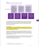
Een tweede fundamenteel punt van kritiek betreft de opsomming van de technische aanpassingen die bij een stelselwijziging nodig zijn. Aanpassingen in wet- en regelgeving, in de ICT, in administraties, enzovoorts, het geheel onder de noemer van ‘bedrijfsvoering’. Natuurlijk moet er van alles gebeuren en het uitwerken en uitvoeren van een transitie levert veel werkgelegenheid (en omzet) op voor professionele dienstverleners, maar is dat voor het grote publiek relevant? Een stelselwijziging vergt politieke wil. Punt. In schema weergegeven de tekst  van het rapport (pag. 446):

Kritiek bij Tabel 1
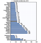
Tabel 1 (pag. 446, afb. rechts hierboven) toont de score van NL t.o.v. enkele andere westeuropese landen op een viertal indicatoren. Algemeen geformuleerd: De indicatoren met voor NL de meest gunstige cijfers worden getoond en een aantal landen die over het algemeen hoog scoren: Noorwegen, Zwitserland, Oostenrijk, Spanje en Italie zijn overgeslagen (!). De tabel dient louter ‘ter illustratie’, weten we inmiddels – zie de correspondentie. Ik noem het cherry picking. Nemen we de indicator ‘vermijdbare sterfte‘, dit betreft ‘amenable mortality’, maar er is ook ‘preventable mortality’. Het CPB toont de ene en laat de andere weg. Het verschil in beide NL-scores is evident. Beide OECD-tabellen hier (links: preventable mortality; rechts: amenable mortality)
Qua ‘Levensverwachting‘ doet NL het minder goed dan wordt gesuggereerd.
Zie mijn eerdere blogs hierover Levensverwachting NL zakt naar 8e plaats in EU14
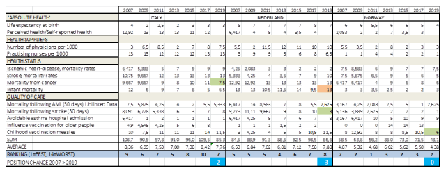
Sinds 2016 doe ik onderzoek naar de uitkomsten van medische zorg in internationaal vergelijkend opzicht. Publicaties in ESB (1/2017) en Medisch Contact (42/2018). Op deze website wordt een longitudinale tabel van beschikbare en relevante indicatoren bijgehouden van 14 moderne europese landen (EU14), gebaseerd op de OECD Health at a Glance publicaties vanaf 2005.
Bronnen: Zelfstandig onderzoek obv. OECD Health at a Glance: Kosten en kwaliteit EU14 obv OECD Health at a Glance
OECD ‘Mortality’ (2018): OECD Health at a Glance Mortality 2018
OECD ‘Chartset’ (2018): OECD Health at a Glance Chartset
Medisch Contact: Medisch Contact 42/2018 Nederlandse zorg valt van haar voetstuk

Categorieen zoekfunctie website: EU14, Eurostat, OECD Health at a Glance, Levensverwachting e.v.

Aanbod second opinion ‘zorg’ in verkiezingsprogramma’s: Aanbod second opinion zorg verkiezingsprogramma’s

Tweets

Bron CPB tijdlijn verkiezingen

Corona Dashboard EW16/W36

Last update 5 august 2020

Corona Dashboard EW16/W36 (closed)

John Jacobs & Gijs van Loef

Data 04 08 2020

Mortality per million population allows comparison between countries. Major differences are caused by differences in anti-epidemic strategy, which may be affected by the preparedness of countries to the epidemic.

General remarks by making a comparison between countries
We would like to make two important notes.
1. Countries differ in the way the count their mortality rates. The Dutch regional GGD stated early in the epidemic that the national RIVM did not count all cases, i.e. the Netherlands have relevant under reporting of cases.[1] People dying in nursing homes are rarely counted, since these patients will not be tested, even when suffering from COVID-19 symptoms. The Dutch statistics do not count untested people as COVID-19 victims. The data can be corrected for excess mortality. Because the data on excess mortality is delayed for about three weeks, a fixed correction factor is applied.[2]

2. Populations differ in age distribution, and old people have higher mortality rates due to COVID-19.
Using the double-corrected data, a ranking is made from dark red to dark green. The current ranking is (Table 1):
Dark red:> 1000 deaths per million population (> 1000 deaths / M). Ecuador, Peru, United Kingdom, Chile
Medium red: 500-1000 deaths / M. Belgium, Brazil, Italy, Spain, Netherlands, USA, Sweden
Light red: 200-500 deaths / M. France, Ireland, Switzerland, Portugal, Canada, South Africa
Ocher yellow: 100-200 deaths / M. Austria, Denmark, Germany
Yellow. 50-100 deaths / M. Finland, Norway, Israel
Light green: 20-50 deaths / M. Estonia, Czech Republic, Poland, Lithuania, Iceland, India
Medium green: 10-20 deaths / M. Greece, Australia
Dark green: <10 deaths / M. South Korea, Singapore, New Zealand, Japan, Taiwan, Hong Kong, Vietnam

Table 1. Overview of mortality per million people (mortality/M), the raw data, corrected for underreporting [a] and age. Data to determine under reporting is derived from various sources.[b]

[a] https://hartblik.weebly.com/beter-c-verschillende-strategieeumln.html
[b] https://www.economist.com/graphic-detail/2020/04/16/tracking-covid-19-excess-deaths-across-countries , https://www.economist.com/europe/2020/05/09/many-covid-deaths-in-care-homes-are-unrecorded , https://www.ft.com/content/6bd88b7d-3386-4543-b2e9-0d5c6fac846c , https://www.washingtonpost.com/investigations/2020/04/27/covid-19-death-toll-undercounted/?arc404=true

It is striking that the best-performing countries are located near Southeast Asia, where the SARS-1 epidemic started in China 18 years ago. Many countries learned from this epidemic and were prepared for a new epidemic[3] Every virologist could have predicted that a new epidemic would come, as I (i.e. John Jacobs) did in 2003.[4]
Controlling a virus epidemic requires a different strategy than a bacterial epidemic. The default anti-virus strategy is testing, proactively detecting and isolation of infected cases.[5] To do this correctly is double efficient: lower disease mortality rates, and less social and economic damage, as only infected cases should be isolated. It is also widely practiced in case of veterinary epidemics.[6]

The policies of European and North American countries had weak to poor antivirus policy results.
Mortality is higher, sometimes up to 100 times higher than in Asian and Australian countries.
The impact on social well-being and the economy is much greater.
The differences within Europe are also huge when Greece and Lithuania are compared to the United Kingdom and Belgium.

We should learn from this epidemic.
It is very doubtful if we will develop a good and safe vaccine soon, since, vaccination is a hard strategy when antivirus immune responses contribute to mortality. It could be that antibody-mediated immune responses are the cause of mortality.[7] In most European countries only about 5% of the people were infected, so this epidemic could continue to spread for a considerable time with the potential to cause high mortality rates.[8] The need to learn and act from the learnt lessons from this epidemic is paramount.
New virus epidemics will come. Just like the prediction of this epidemic decades ago, we know that a new RNA virus epidemic will arise after AIDS, SARS-1, MERS, Ebola and SARS-2.
Our epidemic policy has a major impact on human behaviour and thus on the virus epidemic.[9] If we are prepared [10], the impact could be similar to the South East Asian and Australian countries that prepared themselves after SARS-1.

[1] RIVM is national institute for health and environment. https://hartblik.weebly.com/addendum-correctie.html
[2] https://hartblik.weebly.com/beter-c-verschillende-strategieeumln.html
[3] https://hartblik.weebly.com/voorkom-epidemie.html
[4] https://hartblik.weebly.com/ontsnappende-virussen.html
[5] https://hartblik.weebly.com/fighting-covid19.html
[6] https://hartblik.weebly.com/betere-bestrijding-van-de-epidemie.html
[7] https://hartblik.weebly.com/foute-afweer.html
[8] https://hartblik.weebly.com/beter-a-impact-covid-19.html
[9] https://hartblik.weebly.com/cijfers-en-data.html
[10] https://hartblik.weebly.com/verloren-door-te-weinig-kennis.html

Raw numbers
The Corona Dashboard 1.0 was launched in Dutch at 18th of April 2020 on our websites. It focused at the EW16, 16 ‘modern’ European countries with a population of at least 4 million people. These countries share political, democratic, social economic and technological development, making them excellent for internal comparison. The list consists of Austria, Belgium, Denmark, Germany, Finland, France, Greece, Ireland, Italy, the Netherlands, Norway, Portugal, Spain, Sweden, Switzerland and the United Kingdom. Japan, Republic of Korea (South) and the USA are added to complete the list, therefore EW16+3.

Table 2. Raw data from worldometer from EW16+3 [1]
[1] https://www.worldometers.info/coronavirus/

Reported mortality rates
The 16 European countries have huge differences in the mortality rates they report. Remarkably, the epidemic in Spain is the first one to have higher numbers of mortality, even before Italy. In Belgium the epidemic raised to the highest (uncorrected level), before being stopped (at about 6%) by the national policy.

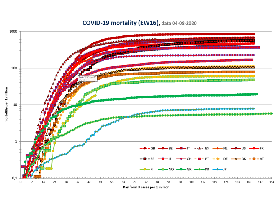

Figure 1. Mortality rates for EW16+3. Above: linear, below: logaritmic
Country codes are explained in Table 1.

Case mortality rates
Case mortality rates show the differences of cases per country. Age corrections is shown to compensate for differences in population distribution. France has corrected its data of the number of cases on june 3d.
Table 3. Case-mortality rates.
Number of critically ill and recovered persons. The lack of data on how many people have recovered, shows the limitations of the care registration systems in the Netherlands, the United Kingdom, Sweden and Spain.

Link between testing and mortality EW16+3
Flu-like symptoms are no evidence for COVID-19, and not everyone infected by SARS-2 will develop symptoms. Policy making on symptoms fails because it discriminates poorly and would have people repeatedly in quarantine due to colds or other respiratory complaints. People succumbing to COVID-19 usually don’t go to many places anymore. Infected people are contagious before they get sick, and not everyone will develop symptoms. The high number of sick people in the Netherlands is partly related to many infected people continuing to spread the disease unmonitored, some even working in care facilities.

Proactive testing starts with testing everyone that has symptoms. If someone test positively, all the contacts will be tested. All contacts who are negative will be retested after 1 and 2 weeks. All infected people will remain in isolation – e.g. in their own house or in special hotels. In Wuhan, the government delivered groceries at their homes, to avoid the need of going outside.

An active testing policy will test many people who are not infected, because the infection rate in the population is usually (far) below 2%. Passive testing leads to a much higher number of infections per test. The danger of passive testing is that many infected people are hidden in the population. It is estimated worldwide half of the infections are caused by people without symptoms. These infections mainly occur in countries that do not test enough. People without symptoms and without a test result have no urgent reason to isolate themselves from social activities or go for  quarantine. Figure 2 shows the statistical relationship between the maximum percentage of positive tests in a country and the mortality rate in the population from COVID-19. Corrected data yield similar results.


Figure 2. Relation between mortality rate and lack of proactive policy, uncorrected data.
The shape of countries corresponds to their continent (circle Europe (EW-16), square other Europe, cross North America, triangle: Australia, diamond: Southeast Asia). Clear correlation. For reference R^2> 0.5 is considered a very clear connection in this domain. Country codes are explained in Table 1.
[1] https://hartblik.weebly.com/dashboard-i.html

Current status EW16+3

The current status shows how the epidemic develops in various countries. Many European countries have experienced a nonspecific lockdown to defeat the virus’ first wave that has paused the epidemic. This required more time in countries that have had a high peak, such as Belgium (Figure 3). The epidemic seems to be in control in all visualized countries, except for UK, Sweden and USA. Most countries have ended the lockdown. This could reactivate the epidemic. (In specific area’s (regions within countries) the virus is resurrecting and regional lockdowns are the governmental response.) The start of the epidemic is less noticeable in a cumulative graph than in a daily graph. Due to daily fluctuations, the data in Figure 3 is averaged over several days.


Figure 3. Daily mortality rates for 16 European countries + 3.
Moving average over 3 to 5 (and 7 if missing today) filtered for negative values and extreme high values (often data corrections). Country codes are explained in Table 1.

Figure 3A. Zooms in on the most recent dates of Figure 3.

John Jacobs & Gijs van Loef
hartblik.weebly.com corona dashboard


Dutch version, including remarks from healthcare experts: Corona Dashboard Dutch version EW16/W28